Author Archives: can.this

Week 13/14: Spatial Temporal Social Media

final

1)     Focus on the story you want to tell

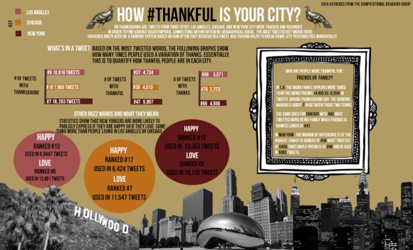
This assignment was extremely challenging primarily because the data set was difficult for me to understand. I didn’t focus so much on the time but rather the content of the tweets from the dataset. I wanted to compare how often people in Los Angeles, New York, and Chicago tweeted about how thankful they were during thanksgiving this year. Were there any discrepancies in the data set regarding the three cities? Although there were definitely slight distinctions, I found that the tweets from the different cities remained to be at relatively the same amount.

2)     What do you hope to accomplish or solve with this piece of communication?

Essentially, I wanted to find how and quantify how “thankful” each of the cities were through this spaciotemporal technology.

3)     Key Audience

I think this infographic can be useful to anyone, primarily people living in the cities mentioned.

4)     Identify Desired User Experience

The user should be able to follow the information based on the hierarchy.

5)     Tone

I tried to convey a serious tone with this project, however I felt that the story I chose to tell would be best portray in a more light-hearted and fun graphic.

6)     Evaluate your Data

The data was extremely difficult to read. I focus on the content of the tweets to break down on a numerical level how distinct different city personalities are.

7)     Infographic Complexity

There is no interactivity for this infographic but there are still a lot of different components to this piece. For one, I’ve quantified the answer to the question I brought in the title through bar graphs as well as re-iterated the ranking system that was used in the data set.

8)     Hierarchy of Information

I integrated the Principles of Design elements to this infographic. The information goes from the most important (these are bolded, highlighted in a different color, or isolated in a separate box altogether) to the least. I chose to keep the font for the large blocks of text smaller as to not overwhelm the reader. The color scheme is relatively simple with the same earth tone hues and the font is a clean sans serif, bebas nuue.
Week 11: Manual Lima’s Visual Syntax: L.A. Radio Stations

Example used: Radial Implosion

Interface:

FinalRadio2

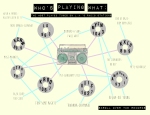
Title: Who’s Playing What: The Most Played Hits on L.A.’s Top Radio Stations

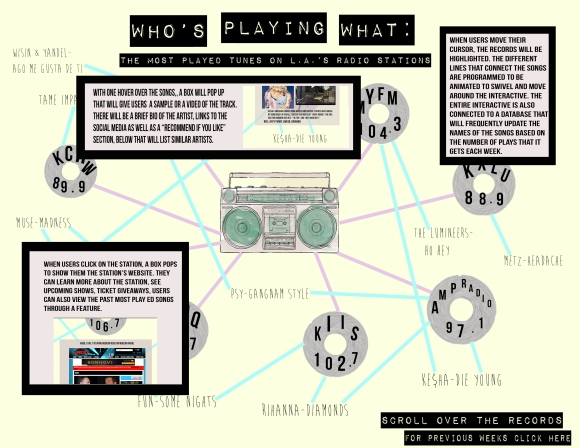
Objective: The objective of this map is to inform the user about the most played songs from the top radio stations in the region. I chose to use the radial implosion as the example for this project because even though it looks convoluted, it fits the style of my topic the most. Since the branches are connected in some areas, people can see what tracks are repeated with different stations through this system.

Identify “user experience”:

The user experience is meant to be easy to use and fairly self-explanatory. You enter through the main page where you are directed right to the interface. There you can zoom in and out of the different features like an interactive map.

Identify syntax used:

I was mostly concerned with having a straightforward and easy to use system. Listing the names of the songs seem to be the most appropriate for this specific interactive.

Identify navigation

The navigation starts from the central point with the boombox then it branches out. All the vinyl is meant to be clickable to let people know a little bit more about the respective radio stations. The different songs are also clickable and will give people a sample of the track. The interacted would be programmed to be connected to an API database that will update the names of the songs frequently.

Identify sequence of actions and functions step by step

The user can enter through the boombox on the main page which serves as a player for all the stations listed. The interactive is designed to function like a map that you can zoom in and out of. Once the user is there, he or she can click on the different radio stations which would be represented by the different records. From there, if the user clicks on the records, a brief description of the station will pop up. They could also be directed to the station’s social media feed.

Color Palette:

Triadic

Fonts Used: 

Brain Flower

Impact Label

Bebas Neue

Data Source List

Since I work for the college radio station, I learned that each radio station that I have encountered—albeit university or not—has its own aesthetic in terms of what type of music is most requested and played. I am always intrigued at the type of music other stations are playing and if the tracks are truly different or if they intersect and to what degree. I have gathered a list of the most played songs from some of my favorite stations in the area and convert it into a flipical implosion graph. My static page is a boombox where people can virtually turn the dial to change radio stations.

KCRW 89.9 Fifty Most Played Albums: http://blogs.kcrw.com/musicnews/2012/11/kcrws-top-50-most-played-albums-for-the-week-of-11052012/

KIIS 102.7

http://www.kiisfm.com/new2/discover/index.html

KXLU 88.9

http://www.kxlu.com/adds.htm

KDAY 93.5

http://tunein.com/radio/KDAY-935-s32724/

KXSC 1560 am

http://kxsc.org/music/

STAR 98.7

http://www.987fm.com/pages/newmusicreports.html

Assignment #7: The Power of Storytelling Using Infographics

SUBJECT: Since the elections are almost here, I knew I wanted to create my infographic based on the growth of social media and how it has made an impact on the political arena. My findings were not surprising-within just four years, since the last election, the amount of influence that social media has upon the political landscape only continues to grow exponentially resulting in campaigns spending more and more money into that medium. I thought it would be fun to recreate a head-to-head battle with the two Presidential candidates to see who would win the race, if it was entirely up to social media presence.

DEMOGRAPHIC: I think this infographic is best suited for someone who is interested in the subject matter of social media and politics. A majority of active social media users are of voting age so this information could be helpful to them.

DATA: Instead of going through the standard public sources of data for my statistics, I read a lot of articles about the subject matter since it has obviously been newsworthy. From the articles, I managed to trace data that were referenced back to the source. I also took to the candidates’ social media accounts for the most current data.

COLOR SCHEME: For the most part, the color scheme remained relatively analogous. I had to adhere to the typical patriotic theme for this project. The background was a lot more neutral when I was putting this together and was supposed to be reminiscent of a cork board, but it is coming off a bit pungent on screen.

FONT: I used one striking sans serif font called Franchise in varying sizes.

HIERARCHY: I divided the infographic into three different areas to establish some sort of hierarchy. The varying different font sizes show the level of importance of information. I chose to isolate all the numbers from the statistics by making them a different color so a reader’s eyes will immediately be drawn to that.

BAR GRAPH: I chose to incorporate two bar graphs in this infographic to show which of the candidates has more influence on what social media mediums. The first shows the average number of retweets for every tweet, which although Romney has significantly less followers than Obama, has more retweets signifying that he has more influence on Twitter. The second bar graph shows the average number of shares for every Facebook post and unsurprisingly, Obama has more influence through that medium.

WEEK 8: Infographic Rough Draft

Rough Draft: How Social Media Has Impacted the 2012 Presidential Race?

Sources of Data:

Social Media Leaves Spin Doctors in the Dust: http://www.sfgate.com/politics/joegarofoli/article/Social-media-leaves-spin-doctors-in-dust-3921046.php

Social Engagement Will Decide Election in 2012: http://media.socialvibe.com/m/site/politicalsolutions/SocialVibe_Political_WhitePaper.pdf

The Effect of Social Media on he 2012 Presidential Elections: http://keystoneclick.com/blogs/lauryn-jashinsky/affect-social-media-2012-presidential-election

Presidential Debates Sets Twitter Record: http://www.nbcnews.com/technology/technolog/presidential-debate-sets-twitter-record-6281796

Politics, Social Media, and the Digital Campaign Landscape: http://www.mediabistro.com/alltwitter/digital-campaign-landscape_b22011

Barack Obama, Mitt Romney Square Off on Facebook: http://allfacebook.com/infographic-barack-obama-mitt-romney-square-off-on-facebook_b100861

Week 7: Dissecting Color Usage in Data Visualization

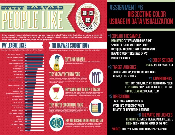
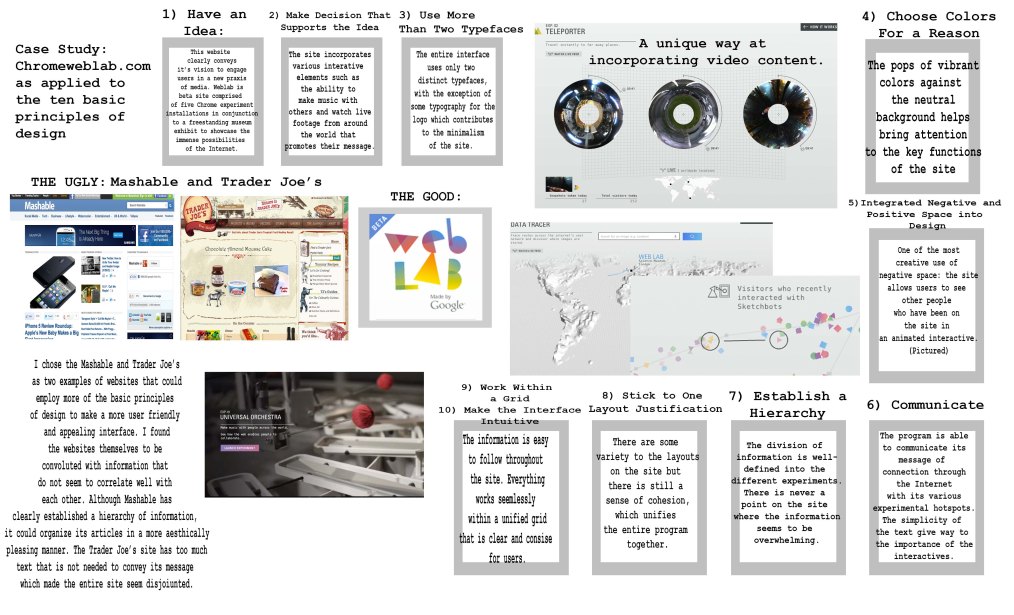
1)   I used an infographic called, “Stuff Harvard People Like,” which compiles data from Quora to show what students who attend Harvard typically like based on their past Internet searches. It is a spin on the “Stuff White People Like” franchise, which lists the myriad of things—usually humorous—that appeals to the specific demographic.

2)   At first glance, I thought the artist just used complementary colors since green and red are the most prevalent and distinct on the page. However, the infographic is actually employs three colors that are on opposite sides making it triadic.

3)   The target audience would be current and prospective students and alumni of Harvard as well as students from other colleges. The infographic mentions that they also gather data from schools like CalTech, MIT, etc.

4)   In terms of graphic and illustration, . The The artist uses a narrow and bold sans serif text

5)   The layout is well-balanced primarily because there are two distinct components: the percentage bar and the graphics with the paragraphs. The viewer does not feel overwhelmed with the amount of information at any given time because a hierarchy is clearly established.

6)   The color scheme strategically influences the thematic elements of the graphic. The shade of red ties in to Harvard’s school colors and makes it more collegiate. The same goes for the navy blue which is a color used for a lot of schools. The muted green color (I describe it to be an avocado green) brings light-heartedness to the page which goes in line with the humor of the infographic.

Week 6: Signage

signage


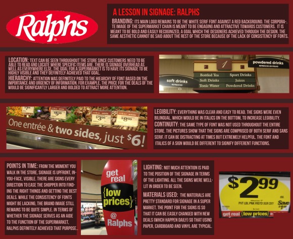
A Lesson in Signage: Ralphs 

Branding: It’s main logo remains to be the white serif font against a red background. The corporate image of the supermarket chain is meant to be engaging and attractive towards customers. It is also meant to be bold and easily recognizable, a goal in which the designers achieved through the design. The same aesthetic cannot be said about the rest of the store, however due to the lack of consistency with the fonts.

Location: Text can be seen throughout the store since customers need to be able to read and locate where specific items are. There is signage overhead as well as everywhere else. The goal for a supermarket to have its signage to be highly visible and Ralphs definitely surpassed this goal.

Hierarchy: Attention was definitely paid to the hierarchy of font based on the importance and urgency of information. For example, the price for the deals of the day would be significantly larger and bolder to attract more attention.

Points in Time: From the moment you walk in the store, signage is upfront, in-your-face, visible. There are signs every direction to ease the shopper into finding the right things and getting the best deals. While the consistency of fonts might be lacking, the brand image still remains to be quite simple. In terms of whether the signage serves as an aide to the function of the supermarket, Ralphs achieved its purpose.

Legibility: Everything was clear and easy to read. The signs were even bilingual, which would be in spanish and italics at the bottom, in order to increase legibility with a wider demographic.

Continuity: The same type of font was not used through the entire store. The pictures show that the signs are comprised of both serif and sans serf. It can be distracting at times but extremely helpful. The font and italics of a sign would be different to signify different functions.

Lighting: Not much attention is paid to the position of the signage in terms of the lighting. All the signs were well-lit in order to be seen.

Materials Used: The materials are pretty standard for signage in a supermarker. The point for the signs is so that it can be easily changed with new deals, which happen daily, so that using paper, cardboard and vinyl is typical.

Week #5: Typography

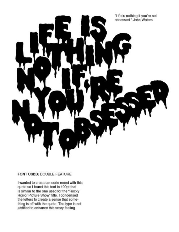
DECORATIVE FONT: Double Feature, 100pt.

I wanted to create an eerie mood with this quote so I found this font in 100pt that is similar to the one used for the “Rocky Horror Picture Show” title. I condensed the letters to create a sense that something is off with the quote. The type is not justifies to enhance this scary feeling.

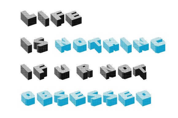
DECORATIVE FONT: Cubefont, 72pt

SANS SERIF FONT: Futura, 72pt and 118pt

For this typography exploration, I was inspired by Barbara Kruger’s body of work, who is known for using bold typography in her art. I wanted to accentuate some words and nothing is more fitting that white text against a bright red background. The mood for this is striking and clean.

SERIF FONT: Times New Roman, 48pt and 18pt

Times New Roman, .48 pt and 18 pt For my serif font exploration, I wanted to create a repetitive and obsessive mood. Times is one of the most used fonts and I wanted to play on that by repeating the quote over and over. The hint of red adds a sense of seriousness to the typography.

WATCH THIS.

Assignment 3: Branding Timeline

Brand Overview:

Created in 1982, “USA Today” is a publication primarily known for producing content that is easier to access for a wider demographic. With more prominent pictures and easier-to-read articles than other newspapers such as “The New York Times” or “The Wall Street Journal,”  “USA Today,” breaks up the traditional layout by including excerpts of stories from each section on its front page. Consisting of angular and concise shapes, the original logo and font reflected the time period when the publication started. Over the years, the publication has made several changes in an attempt to keep up with the evolving world.

Period of Time:

The timeline spans over a period of thirty years, from when the publication first started up until it made headlines just last week for unveiling its new brand identity.

Imagery and Principles of Design:

I tried modeling this timeline to look like an infographic that would appear on the pages of “USA Today,” by using colors that would make a statement and utilizing text in an entertaining but informative way. I wanted to keep the timeline primarily linear as to not detract from the new circular logo. I used the same blue from the logo all throughout the timeline to create a sense of cohesion.

Analysis:

The brand prides itself in being able to appeal to wide demographic, essentially America’s publication and the new logo reflects this aesthetic even further. The new identity is fresh, bold, and vibrant. It brings more attention to the articles by increasing the negative space, implementing a new sans serif font and larger logo. Additionally, its color-coded sections effectively divide the content and help the readers direct their attention to what they want to read.

Stephen Colbert recently poked fun at “USA Today”‘s new brand identity. Click to view the video here.

Assignment 2a: Web-site Analysis Based on Process

For our second assignment, we were asked to analyzed the design of a website.

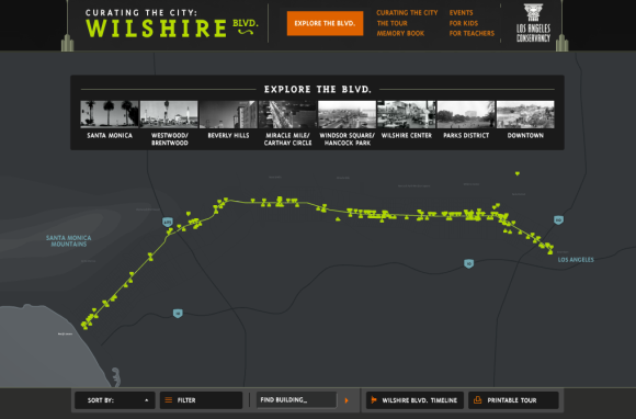
  • The primary purpose of Curating the City is to inform and engage users about the expansive architectural and cultural heritage in L.A. through an interactive medium. The website incorporates various visual components to educate people on the history of famous landmarks in the city.
  • I think people will respond well to the aesthetic and mood of the site. The black and gray color scheme is ideal for a website about buildings but the splashes of green, orange, and blue throughout adheres to mood of L.A.
  • The function that allows people to add their own personal experiences for the “memory book” creates another dimension of interactivity. These stories serve to connect human ethos to concrete structures, which ultimately becomes more effective to serve its message.
  • The main audience that this program is targeting towards is primarily the educational set (students and teachers) but also for those working in the industry (engineers and architects) who can use this site as a simple database.
  • This program is effective in helping the Los Angeles Conservancy serve its purpose to restore and maintain historic buildings as well as to educate the community about the city’s resources.
  • One thing that the website could improve upon is the photography as for most buildings, only two exteriors shots were featured.